” ... consistency matters because property managers handle important tasks like payments, leases, expenses, maintenance, and file storage. When the interface is clear and stable, users can focus on their work instead of figuring out the software.”
HOMEPRO UI/UX Design: Why Good-Looking Software Matters
In property management software, appearance and usability work together. A clean interface helps users find information faster, complete tasks with fewer errors, and feel more confident using the platform. In the latest HOMEPRO release, we’ve introduced our File Explorer and the updates shown here are a good example of that balance. They use modern design standards, familiar interaction patterns, and functionality shaped by common property management tasks and user feedback.
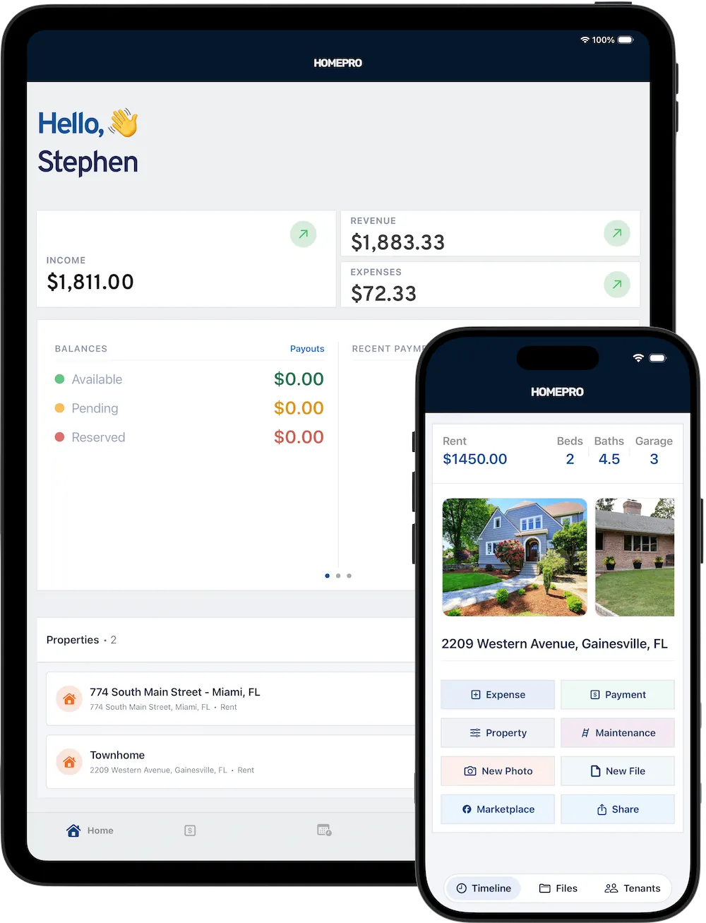
Property Detail & Prioritizing Clarity
The property detail view presents the most important information first. The property name and address are prominent, followed by actions for Expenses, Payments, and Files. This creates immediate context and gives users a predictable way to complete common actions.
The main layout is built around cards. A large property image anchors the page, while summary cards display core details like monthly rent, and lease end date. This structure makes the screen easier to scan for related information by being grouped visually instead of being placed in one long list.
A key design detail is the use of soft outlines around the card views. These light borders help separate content without making the interface feel heavy. Rather than using strong dividers or dense shadows, we use subtle boundaries that keep the design open and readable. This improves hierarchy, supports quick scanning, and gives the interface a more polished look.
The action row, Add Payment, Add Expense, Add Maintenance, and Edit Property also reflects practical UX thinking. These are common property management tasks, so placing them in a visible, accessible location reduces friction. It also shows how HOMEPRO’s functionality is aligned with real user needs.
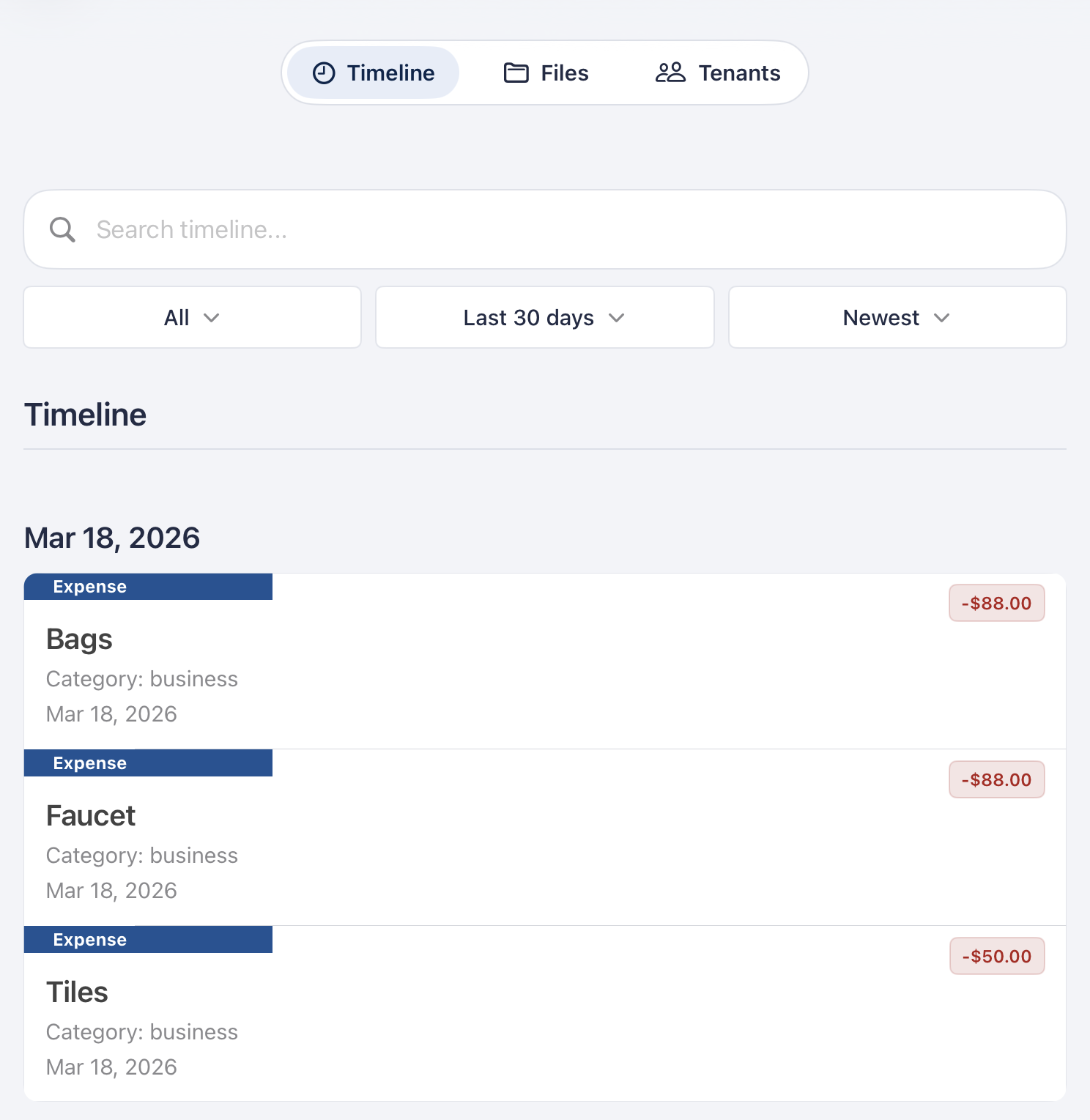
Timeline Activity Design
The lower section of the property screen includes tabs for Timeline, Files, and Tenants. This supports quick switching between related data without forcing users to leave the property context.
The activity list uses icons, dates, labels, and color-coded amounts to visually distinguish rent payments from expenses. Green indicates incoming money and red indicates outgoing amounts, which matches common user expectations. Combined with generous spacing and clean row separation, the list remains easy to read even when multiple records are shown.
This is an important part of good UI/UX design: presenting dense information in a way that still feels manageable.
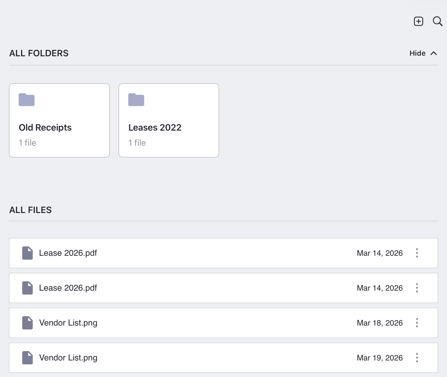
File Explorer & Structure
The file explorer is organized into two sections: All Folders and All Files. That structure supports the way property managers actually work with documents. Some users prefer browsing by folder, while others look for a specific file directly.
The folder cards use the same visual language seen elsewhere in HOMEPRO: soft outlines, balanced spacing, and simple iconography. Each card includes a folder icon, folder name, and file count. The result is a clean layout that feels organized and easy to navigate.
The file list below follows familiar design standards with a file icon, file name, date, and overflow menu. Because these patterns are widely used, the screen feels intuitive with very little learning required. This is where using design standards leads to high impact: users can rely on conventions they already understand.
The functionality here also reflects user feedback and common property management workflows. Organizing leases, receipts, inspection reports, and other records is a routine task, so this layout helps users manage documents in a practical way.
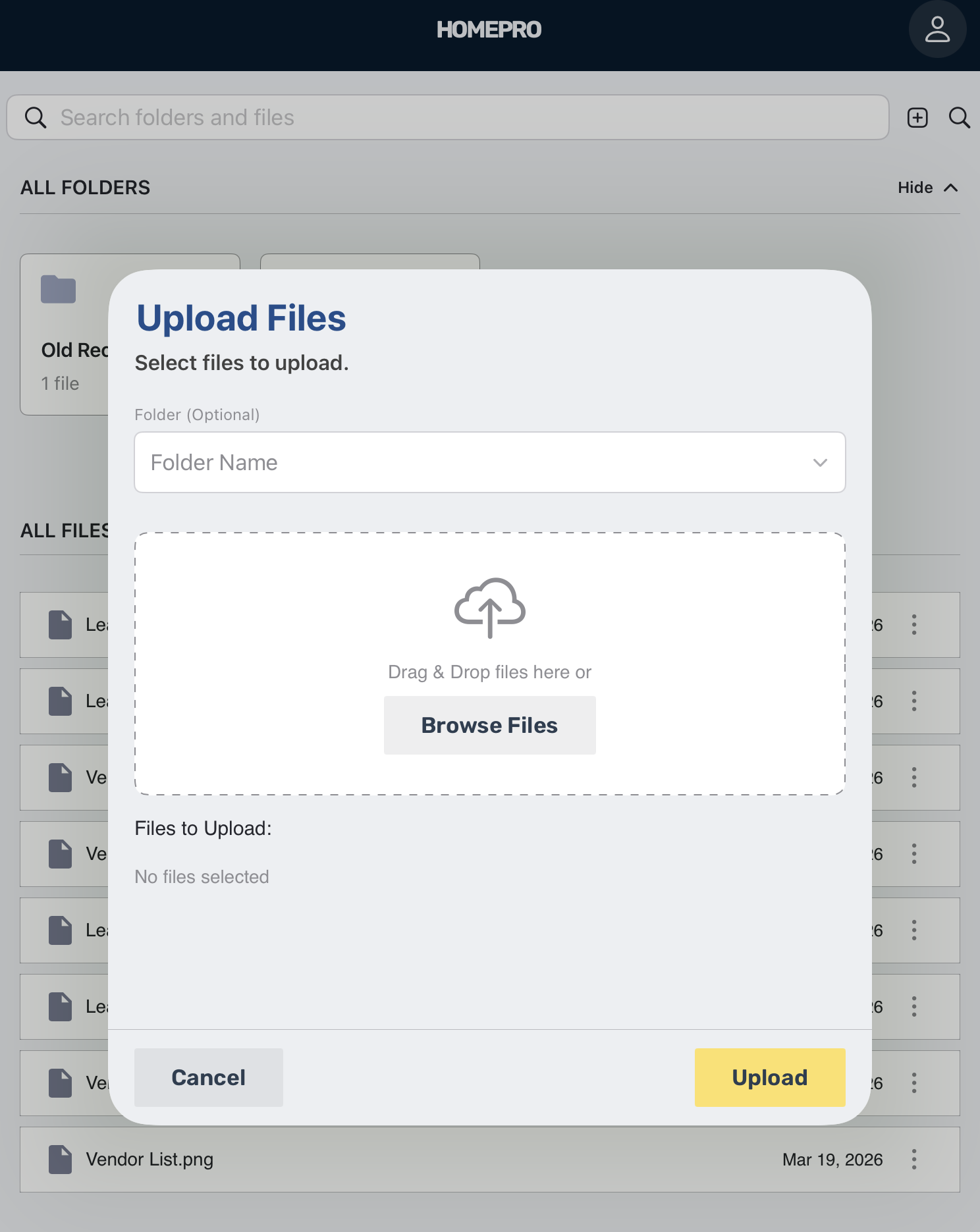
Keeping Uploads Simple
The file upload screen shows a clear, focused modal for adding files. It includes a title, brief instructions, a drag-and-drop area, a Browse Files button, a file status area, and clear Cancel and Upload actions.
The dashed outline in the upload zone is a familiar visual signal for an interactive drag-n-drop interface. The cloud upload icon and supporting text reinforce the purpose of the screen without adding clutter. This makes the workflow easy to understand at a glance.
Like the other HOMEPRO views, the modal uses subtle visual boundaries rather than harsh framing. That consistency helps the upload process feel like part of the same system, which improves trust and usability.
![]()
Why Design Standards Matter in HOMEPRO
These product views show how design standards improve software quality. In HOMEPRO, those standards appear through:
- Consistent card layouts
- Clear typography hierarchy
- Predictable tabs and action buttons
- Familiar icons and menus
- Soft outlines that define content without visual noise
This consistency matters because property managers handle important tasks like payments, leases, expenses, maintenance, and file storage. When the interface is clear and stable, users can focus on their work instead of figuring out the software.
Final Takeaways
In the latest HOMEPRO app release, we demonstrate that good-looking software is not only about aesthetics. It improves usability, supports trust, and makes routine property management tasks easier to complete. The property detail page, File Explorer, and upload flow all show thoughtful UI/UX decisions shaped by user feedback and everyday workflows.
Most importantly, the soft outlines around card views help organize information in a subtle but effective way. They add structure, improve readability, and contribute to the polished, professional feel of the platform.
For HOMEPRO users, that means a better experience overall: clearer information, smoother navigation, and software that feels built for the realities of property management. Generative AI can’t reproduce the level of detail that makes HOMEPRO’s new features special. Email suggestions for new features to: hello@home-professional.com.